Los interioristas Michel Penneman y Catharina Eklof y el arquitecto Patrice Lémeret son los responsables de la rehabilitación de este impresionante hotel, el Tenbosch House, situado en Bruselas en un edificio histórico de 1906.

Lee la nota a continuación sino en http://yatzer.com/The-Tenbosch-House
The structure consists of two art nouveaux houses originally built circa 1906 which have been reconfigured to meet the needs of the wonderful world of exquisite hotels. Situated in one of Brussels' most prime locations ‘Rue Washington’, the exterior façade has undergone a very careful and respected face lift to bring the two buildings into the world of forever, young and timeless existence. Of course we all know that looking young while retaining your personality is all about the skills of the ‘surgeon’ architect and his ‘nip and tuck’ skills. This lift definitely doesn’t qualify as one of those cases were you are left smiling into eternity while everyone else is starring at you wondering if that is you or just a bad version of you. This is one of those successful younger and refreshed you lifts. The dark framing in combination with the large clear glazing, the grey old world stone and the white cladding take you into modernity, artfully retaining and respecting the importance of the building’s historical value.
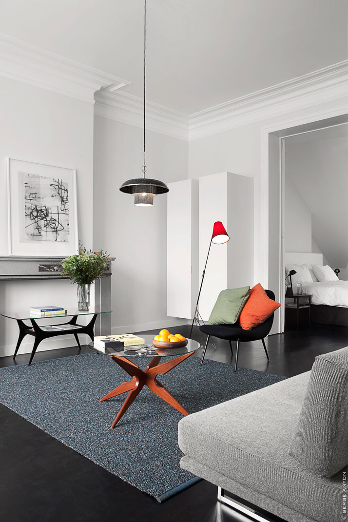
photo © Serge Anton
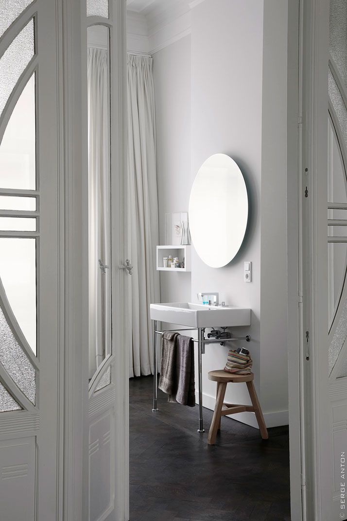
photo © Serge Anton
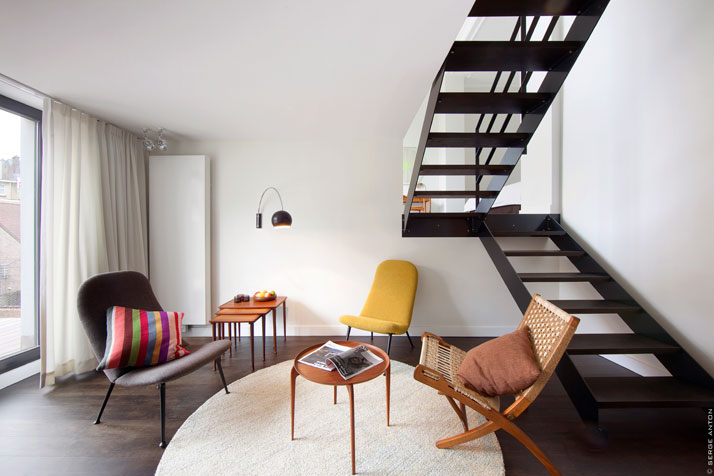
photo © Serge Anton
The interior is just as gloriously respectful and successfully lifted. Walking inside, escaping from the sounds of the street, you enter into a world of warmth, new, quiet and luxuriously white. The finishes are kept to a strict order of ‘less is more’, consisting of the ambient white, the wooden herringbone flooring, the glazing, and the white painted detailed molding. The overall interior concept of the 7 spacious suites of the Tenbosch House is the surrounding pure white colour with the ambience of the high ceilings treated with detailed designs where the only non white factor is the timeless wooden floor. The reminiscent art nouveau stair case is the dominant interior feature. The detailed balustrade and the dado rails together with the large gallery type landings fitted with carpet give out a wonderful feel of comfort and exclusivity which is one of the key elements why we love this interior. This staircase is also one of the most prime settings to exhibit the famous 14 series articulated glass sphere light pendant of Bocci. This openness which has been incorporated both in the ambience and the design of this hotel is of a prime example of a space were design matters.
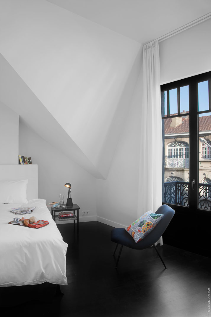
photo © Serge Anton
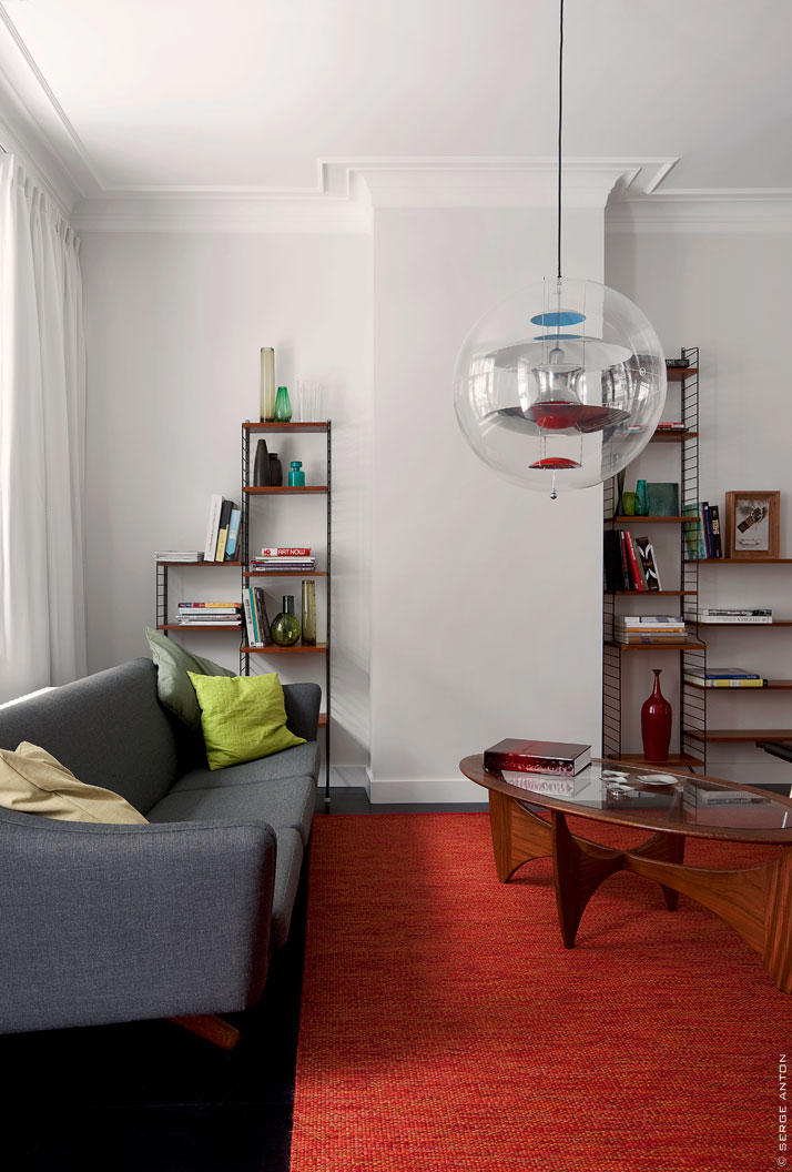
photo © Serge Anton
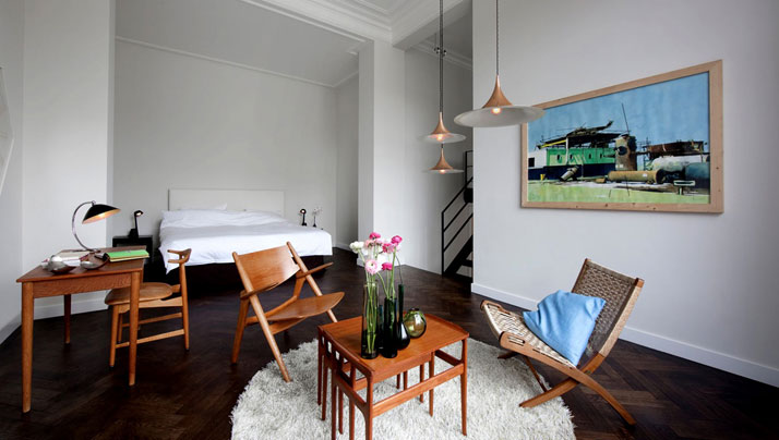
photo © Serge Anton
Through the retention of these large open space interiors, you are again brought to the historic importance which is everywhere. The marble fire place, the timeless almost full height doors with the insertions of opaque glass (ahh!! the beloved French type doors) the staircase, the balcony motif railing all that is important to understand were this building comes from is there and from there on the world of Scandinavian Design is introduced.
Most people’s perception of Scandinavian Design is something along the lines of wood, simplicity, rawness, cold; a world where form follows function. Designers Michel Penneman and Catharina Eklof have just lifted that perception. In these interiors a great spec. has been achieved to show the world that all can be re-evaluated with design. In the bedrooms, the reception, the bar and the foyer we see typical cast 60’s Scandinavian furniture such as Hans Wegner chairs, Poul Henningsen lighting and Nisse Strinning shelves which are incorporated as comfortable, atmospheric, inviting, colourful etc. In this project, it’s all about the game between the designer and the angle Belgium's Tenbosch House opens its doors from a very successful facelift. Younger and Timeless is always better for you to look at things from. It’s all about the pillow, the fabric, the carpet, the accessory, the light, the image. Or another word for it, IT’S ALL ABOUT THE FACE.
The face and body is the norm of our age. As to whether this is fortunate or otherwise, we leave that up to your depiction. What we can positively say with pure and total awareness is that, it’s all about the man that lifts the face.
It’s all about DESIGN.
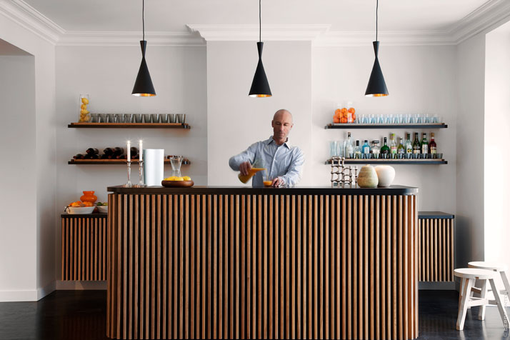
photo © Serge Anton
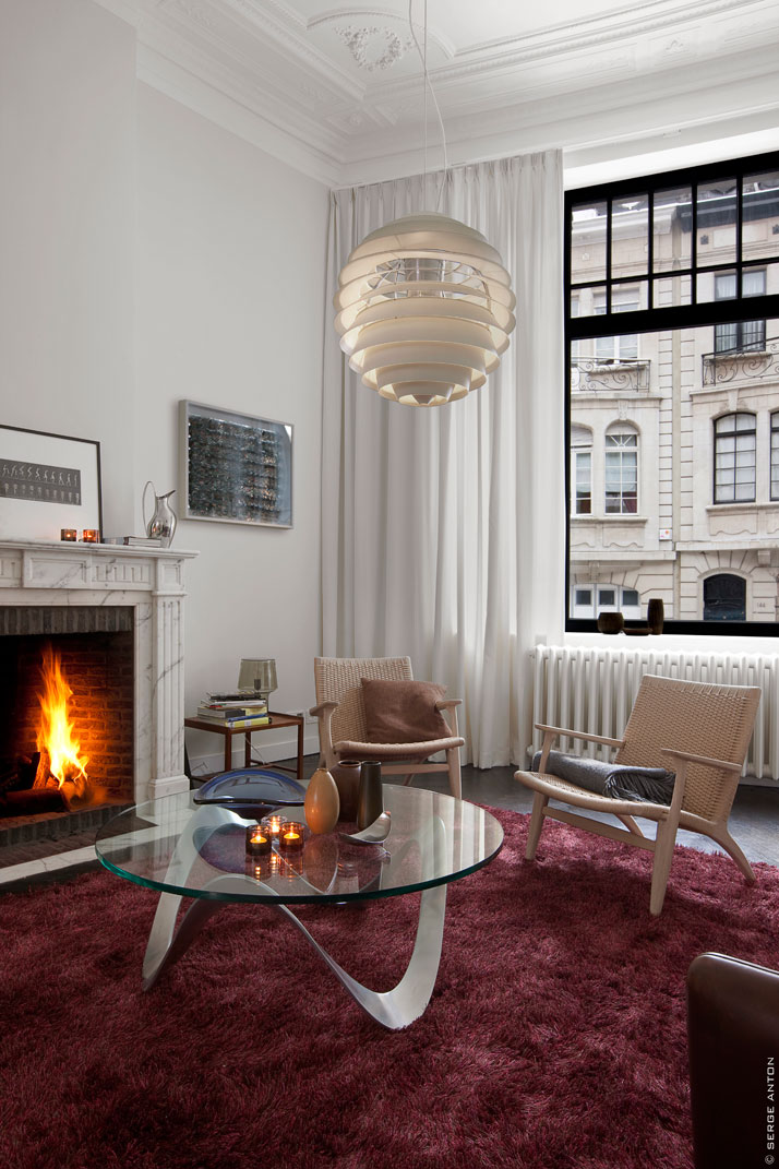
photo © Serge Anton
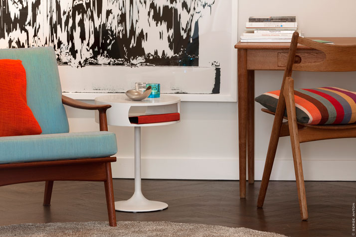
photo © Serge Anton
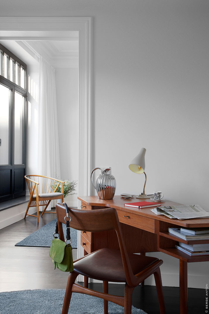
photo © Serge Anton
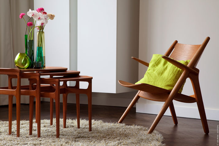
photo © Serge Anton
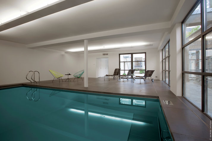
photo © Serge Anton
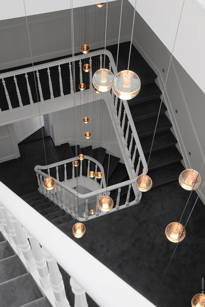
photo © Serge Anton
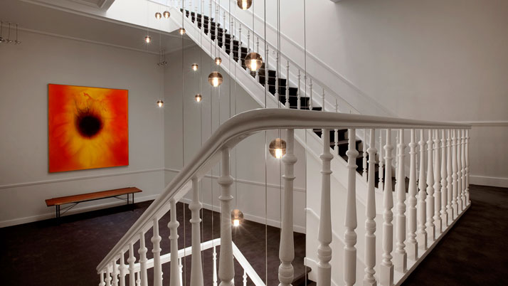
photo © Serge Anton sources:
Tenbosch House // 131-133, Rue Washington, 1050 Brussels, Belgium
photo © Serge Anton
No hay comentarios:
Publicar un comentario